 |
|
In most of Texas and the southwest, color areas can be changed out 2-3 times per year. Spring planted annuals are usually set out from late February through the first of June. A second planting of heat tolerant annuals, such as verbena, periwinkle or portulaca, is frequently used from June through the hot summer months. Fall planted annuals, like pansies and dianthus, are generally set out when temperatures begin to cool off in late September-October. Managing color change outs is an important part of keeping plant materials looking their best.
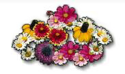
Using color seems so simple. Purchase all the colorful plants that catch your eye at the nursery and pack them into any empty spaces left in the landscape! It works for me. But sooner or later, most gardeners want more from flowering plants than vivid splashes of haphazard color.
Before examining the use of color combinations in the landscape, we must first learn the basic rules of color. First, we'll examine the color wheel. A color wheel is nothing more than a rainbow in a circle. It's relatively simple. There are three primary colors on earth; red, blue, and yellow. We also have black and white, which don't really count as colors. All additional colors are created through combinations of red, blue, yellow, black, and white. The secondary colors are purple (equal portions of red and blue), green (equal portions of blue and yellow), and orange (equal portions of red and yellow). Shades of colors are created by adding black to them, and tints are created by adding white.
Red, orange, yellow, and combinations thereof are considered hot colors. Hot colors are noted for appearing closer than they really are, catching your eye first, and for presenting a "hot" lively atmosphere. If you want to attract attention to a particular landscape feature, such as a view or doorway, consider using hot colors. You might also want to use hot colors to draw the eye away from an unsightly view such as a parking lot or the neighbor's "trashed out" backyard.
Purple, blue, green, white and combinations thereof, are considered cool colors. Cool colors are noted for appearing further away than they really are, and for presenting a cool, relaxed atmosphere. Pastels (colors tinted by adding white) are normally considered cool colors. Cool colors are great for making small areas seem larger and for giving the visual appearance that it's cool here in the South (that's visual, not physical!). Cool colors are also effective in sitting or meditation areas, presenting a tranquil mood to the visitor. They might also be worth a try outside the window of cranky neighbors.
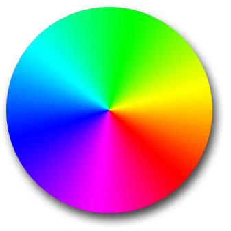 Colors opposite on the color wheel are known as complimentary colors. I've
never really considered them complimentary, but I didn't get to make the rules. These opposites on the color wheel provide the maximum contrast possible. Therefore red and green, purple and yellow, and blue and orange, are considered complimentary or "contrasting" colors. There's no better example than red flowers or fruit against green foliage to show this power of presentation. This means that if you truly want a color to stand out and grab attention, place it in front of, or next to, its opposite color.
Colors opposite on the color wheel are known as complimentary colors. I've
never really considered them complimentary, but I didn't get to make the rules. These opposites on the color wheel provide the maximum contrast possible. Therefore red and green, purple and yellow, and blue and orange, are considered complimentary or "contrasting" colors. There's no better example than red flowers or fruit against green foliage to show this power of presentation. This means that if you truly want a color to stand out and grab attention, place it in front of, or next to, its opposite color.
If you have a choice, neutral colors such as gray, or earth tones like brown, tan, and olive, make good backgrounds for presenting color. They also provide the least amount of interference with your display. Keep this
in mind when deciding the color of your house, fence, deck, and retaining walls.
Gray and white also have special properties. Normally they can be used anywhere in the landscape without interfering with a color scheme. They are also useful for transition from one color scheme to another. White is famous for lighting up landscapes as well. Therefore, in areas with a lot of shade, or where there's a predominantly green background, such as East Texas, consider white flowers or plants with variegated foliage. White's opposite is of course black, and therefore, would provide its maximum contrast. Black plants are a little hard to come by though!
Without a doubt, my favorite color combinations are those using related colors. These are what I truly consider complimentary colors. Related colors, those next to each other on the color wheel, come with a built in "harmony guarantee". They are naturally harmonious because they are a part of each other. Once again, it's relatively simple. Choose your favorite color or any color for that matter, and use any colors you want along with it as long as they share a common color. For example, a bed full of white, pale pink, bright pink, and red begonias is very harmonious because it consist of colors all made from red and white. These intermediate colors are made from red and white together. Theoretically, you can tie any colors together by using intermediate colors between them.
Nature is a very good teacher here. Take a peach for example. It's really yellow and pinkish-red. But look between those colors and you see a multitude of yellow, pink, and red combinations. Also, as the flowers on the Butterfly Rose (Rosa chinensis mutabilis) change, notice that they go from yellow through orange to pink but have all combinations between them. Stay on the lookout for flowers which are a mixture of colors. They allow you more flexibility in color scheme choices. Bicolor roses like Peace and Mrs. Dudley Cross would allow you to use yellow, white and pink along with them. Pink flowers which fade to lavender tones, like Old Blush and Caldwell Pink roses, allow you to use purples, mauves, blues, and pinks along with them. Irene lantana would allow you to use yellows, pinks, and oranges along with it. Get the picture? Use any colors that you want as long as you tie them together with colors in between, or flowers having a combination of both colors.
Another use of color which is very effective is a monochromatic color scheme. To achieve this effect you use any plants that you want as long as they are the same color. For example, you might want to try combinations of New Gold Lantana, Samantha Lantana, yellow Marigolds, Candlestick Plants, Euryops, Moonbeam Coreopsis, Dalberg Daisy, Sunflowers, yellow Zinnias, yellow Purslane, Variegated Ginger, Gold Dust Plant and Golden Euonymus in your summer landscape for a brilliant all yellow scheme.
There are several other "rules" you might want to consider. First, color is more visually effective when used in mass in your landscape. Try to avoid placing small spots of color in the landscape. It's too hard to see. Also try to limit your use of total colors, mainly unrelated colors, in the landscape. There is however, some historical precedence in using a multitude of colors in certain situations. If you are restoring an early Texas farmhouse or a Victorian mansion, riots of unrelated colors work well. Also English style herbaceous borders and cottage gardens can accommodate multi-hued color schemes.
Your best bet in using color is to set your rules and limits ahead of time. Then you know exactly what you can and can't use when your shopping. I know it's hard, but try to avoid forcing colors into the landscape without prior thought. You'll get more for your money if you make every color count. But as the saying goes "rules were made to be broken." So if you're happy with your color schemes, that's what counts. But for those who aren't so artistic, stick to the basics, follow a few simple guidelines, and your neighbors will be green with envy.
Color Combinations to Consider:
|